
Google says every search-intent on the net will ultimately result in a purchase. If you are a law firm, someone will search to land on your site and may ultimately end up buying your services or someone else’s. The point is that at the end of the entire game-play is a sale somewhere. And that process usually begins with a search.
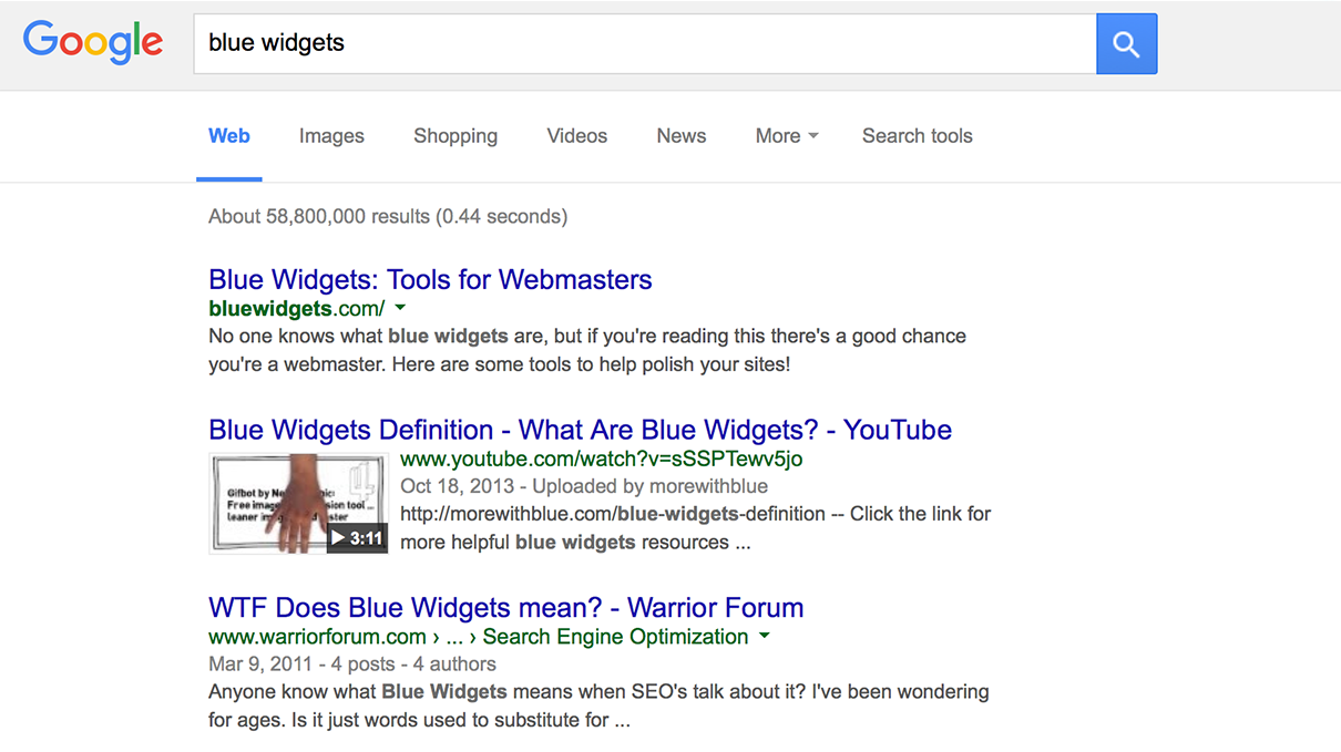
The search very basically is a keyword match, though this day the match and ranking is done with extremely complicated algorithms. And today when a page ranks in the SERPs (search engine result pages), the algorithm primarily ranks a page if it matches the search intent of the user. Search engines know the implicit meaning of your query. They are able to tell if a user is searching for a “match” as in a sport or “match” as in a “matching” sense or “match” like a match-box. The proof of this can be found in Google’s Rating Guidelines document.
-
Contents hide
Get the <title> right
What happens when the user sees the results page? The most highlighted piece of text is the title tag. It draws all the user attention and is your best bet to make the right pitch and get clicked. It is what decides the fate of your landing page. Combine that with a suitable description that is relevant and catchy and the user is all yours.
-
Tweak the landing page to “customer intent”
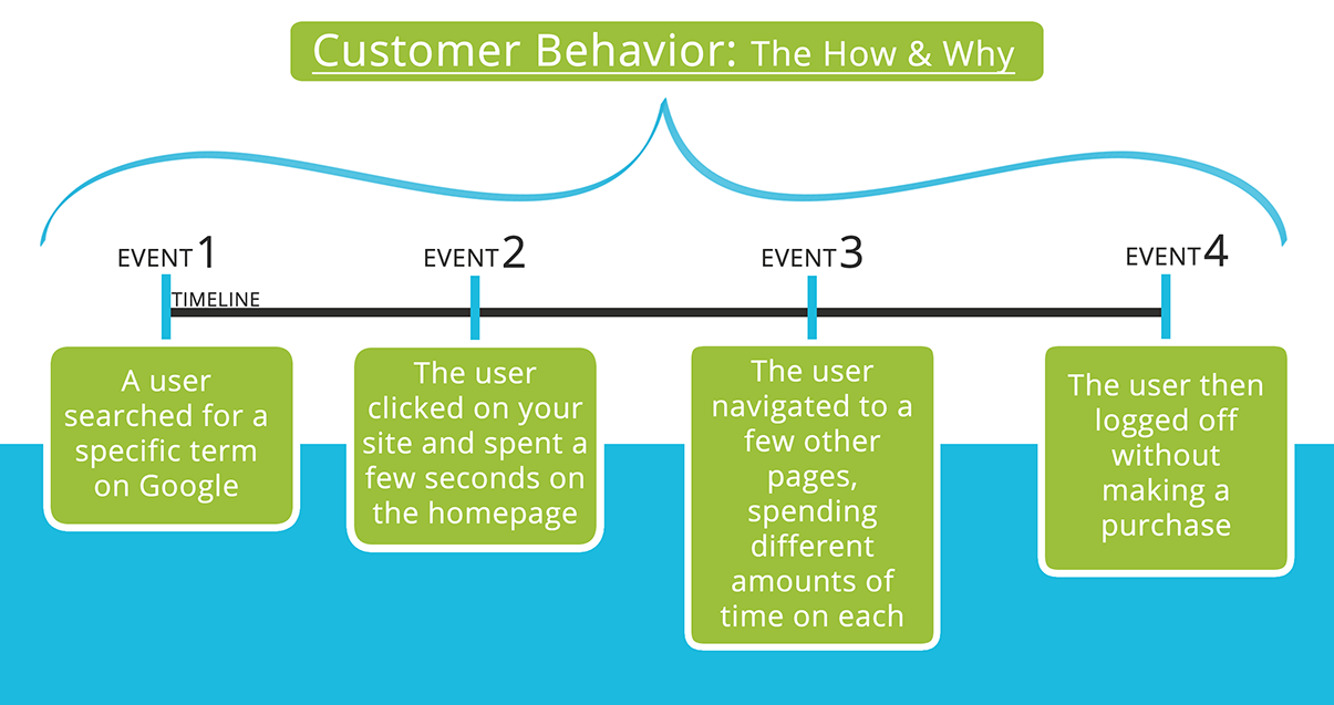
Google also ranks the landing pages depending on the intent. Every page has an intent – a purpose. If the purpose is clear and obvious the page is more suitable for a particular intent. If the purpose is unclear or ambiguous the page typically ranks low. Once the user lands on the landing page, he is looking for something precise. He had his expectations set when he clicked on the search result. If he finds the page relevant he will continue consuming the information else he’ll just go back, click on some other result or refine his query unless he finds what he is looking for. The lesson to take is, study your landing page. Does it have the same intent and purpose as the searcher is looking for? Is it clear and obvious or does the user have to dig for information?
-
Put in a video
The video is your elevator pitch. It’s more dynamic and action filled than static text. You can put in effects that you like to make it look more professional. Or it could just be a casual, you welcoming the visitor. A video is a better tool for grabbing visitors’ attention and establishing trust because it makes it easier for the visitor to see what you do or to relate to a person’s face. Tip: don’t try autoplay. You don’t know if it’s 2:00am at night on the user’s end or if he is visiting your site from his office. Either ways there’s a surprise element with autoplay and it will force the user to fix the autoplay rather than paying attention to the subject matter of the video.
-
Social proof is a must
There’s quite nothing that works like social-proof. It’s easier to believe a third person who has experienced the product or a service that the seller himself. It’s all psychology and the human beings have a very precise BS meter. Social proof works like magic. If others have good things to say about a product or a service then we are more inclined to believe and make the purchase.
-
Sell in the headlines
The screen is not a reader’s medium. Unlike the non-luminescent, eye-friendly page of a book that can be read from the comfort of your bed without distraction, the screen is luminescent, shiny thing that subconsciously irritates the human eye. It’s not a natural reading medium. And there are 79 other tabs open. Slight distraction and the user is gone. No one has the time to read. The best you can do is to grab attention with a headline. And if the headline doesn’t make sense to the user, rest assured there’s nothing else that will grab attention. Headlines should be right on purpose, meaningful and catchy. That’s the only way they work.
-
State the deal–what does the customer get in return
Lot’s of reading and pitching can help grab the visitors’ attention. But when you need that last push, stating what the visitor gets from the purchase helps multiply your conversion rates manifold. It clearly states the visitors’ what they will get in return and that pushes them forward to make the purchase.
-
Why you?
Are you the only one offering this? Are you the only one who is this good? If so good luck to you. But chances are that you have competitors. And here it becomes critical to state the reason why your product or services are the best choice. Mention those critical things that only you can offer. State the reasons why buying from you is a smart choice.
-
Giant Call To Action (that can be seen even in the dark)
When the user has already made up his mind to buy your product, he should not be hunting for the “BUY” button. The buy button should be prominently placed at the most convenient location that he should just be waiting to click it the instance he falls for your goods and services. That’s make for a winning conversion. A giant CTA (call to action) button reinforces the purpose and the ultimate goal and the action that the visitor is supposed to take on the page. Make no mistake – the sale is not over until you make the sale. And no amount of pitching can make up for a good CTA. Tip: Avoid distracting CTA buttons. They should be obvious but not interfere with the experience of the page. Let the visitors take their time before they are ready to press the BUY button. And when they do, the CTA should be right there.

-
“Simplify”… really simplify forms
Simplify things–not like the way you feel it right but like the way they’d make Steve Jobs happy. Instead of putting 22 fields in a form to fill, start with the most important and continue putting the rest to make the form work. And this ends with the submit button. If there’s any other field that makes you happier, chances are that the visitors don’t need them. Better to get a lead and qualify them later than to lose one. And forms shouldn’t be a way to qualify leads. Get a lead and talk to them or have a video call. That qualifies them better.
-
Track on-page interactions and bounce
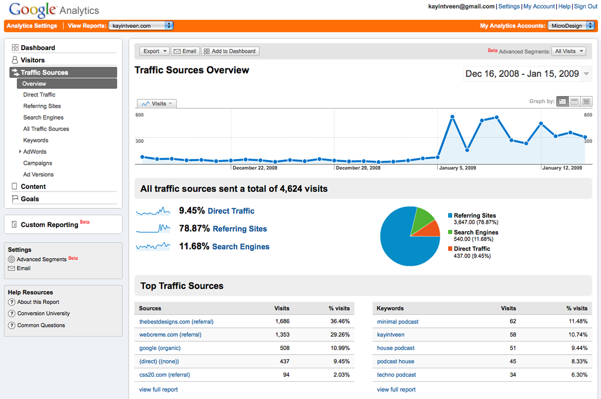
Not all visitors convert. In fact a majority of the visitors are not your potential customers. But focus on those who are. The way to do that is to focus on the bottleneck and the challenges they face while on the page. There are tools that allow you to track the way users interact with your landing page. Open Web Analytics records users actions like clicks and scrolls and the entire animation in addition to the heatmap. Crazy Egg is another good tool for studying heatmaps. Feel free to pick your favorite and study the user behaviour. This will help you understand, tweak and fine-tune your landing page for a better user-experience and a higher conversion rate.
-
Deliver exceeding the expectations, ask for testimonials, rinse and repeat
This would be obvious. But make no mistake. If you want to be in the game for the long run, make sure you consistently deliver beyond expectations. Get users’ feedback and find out the areas where you can improve. And positive feedback always makes for a great testimonial. Once you have it, just ask the client if you can use it as a testimonial on your site. Chances are they’ll always approve since they are happy.
Getting your conversion rates can be tricky and requires continuous work. Put yourself in your visitors shoes and try to identify what could help them have an easier purchase experience. And be willing to hire a smart professional who can take a look and make things work. Because at the end of the day, that’s what will make for a great return of investment.