
Mobile-First approach is doing the rounds — for more than one reason and aptly so. Google is prioritizing its mobile-first index which will impact your search ranks. Mobile traffic is generated by the visitor segment who uses portable devices to search and / or visit websites. In the recent years, mobile traffic has grown to over 55% of the overall search traffic.
Mobile UX & Impact on User-Intent
The impact of mobile-first UX lies in a simple question: Who is using mobile devices?
It’s basically people on the move: people traveling, driving, hanging out in a club or looking for one etc. Mobile devices have penetrated our lives leaving laptops and desktops for more complex tasks like taking care of monthly household budget where in you may work with complex programs like spreadsheets etc. For everything else, there’s internet and a browser is all that you need.
Did you know that Google hires people to audit some websites manually and user-intent is the key deciding factor?

When the majority of visitors are using a portable device, it’s only sensible to rank websites based on their mobile content. And with the concept of user-intent comes into play mobile-experience. Here’s an example:
Kelly is taking a flight and is waiting at the airport. She is looking for a taxi to pick her up at the destination. Obviously Kelly is going to use her iPhone instead of her MacBook for this task.
What is Google supposed to show for “airport taxi pick-up in Berlin”? Of course the relevant websites which provide such a service. However now the way sites would be ranked is going to be based on the user-experience of the website on mobile-devices instead of desktop.
Concept: How is Mobile UX different from desktop?
While content is obviously a major factor for the ranks, Google also takes note of bounce-rates, the CTR of the search results and several other factors on similar lines.
Here’s how things can be different on mobile vs desktop:
Case 1: Uber at the airport. Get picked up and dropped off.
Case 2: Airport taxi service in Berlin: Enter source & destination.
While both the pages are catering to the user’s intent, the second one helps them achieve their purpose luckily in time before Kelly’s flight is announced.
The length of copy on the page has its own impact. If you are buying something as simple as an SD card for your camera, a title like “Sony 32GB SD card for camcorders, cellphones” than a more complex headline like “Sony 32GB SD card, Class 10, 100/MB. Compatible with camcorders, cellphones and standard devices” with a list of 10 other specifications down below will only end up confusing the user or making them more curious.
A person looking to pick up a SD card at the airport shopping mall may not have as much time as the one on a laptop. Both are vastly different use-cases and obviously time is a deciding factor.
Mobile devices are typically used in a casual day-to-day basis or on the run. While a techie looking for a SD card upgrade is more likely to open up a browser on a laptop with 25 tabs and compare things side by side.
In short, it’s as simple as finding out the closest restaurant before it closes versus picking a fine-dine for your upcoming anniversary one week later.
Conversions are all about achieving a goal in the shortest practical time span.

Now it’s Your Search-Rank at Stake in Addition to Conversion-Rates
We’ve worked with a lot of marketing agencies and have seen various kinds of tests like A/B tests with design, variants of heading, content etc. All this was geared towards the end-goal of optimizing conversion rates. But as if this push was not enough, now Google is behind us to give us that last push — if your site is not fast and performant, you don’t deserve our ranks either.
That’s a double hit.
Now you’ll also lose a share of traffic that you were trying to convert. This is getting serious.
Benefits of a Mobile-First Approach
There are two primary benefits of a mobile-first approach:
- User-Experience
- Website Speed

These have further indirect effects:
- Conversion-Rates
- Better ranks in Google search
- More traffic to play with
- Lower bandwidth consumption (for your website as well as cellphone data)
- Customer loyalty
- Better UX boosts CTR and search-ranks further
Google’s Mobile Usability Report
Don’t ignore Google’s indicators. Google Search Console features Mobile Usability to report usability issues on mobile devices. This report identifies the pages on your site with usability problems (like using flash content, fixed-width viewport, small font size, touch elements too close, etc.) for visitors on mobile devices. And it strictly advises,
Fix mobile usability issues affecting your site. Websites with mobile usability issues may not rank as well in mobile search results.
And with the latest updates rolling in, it will not rank the websites with mobile usability issues in search results as well (not just mobile search results).
I’m sold. So technically, what exactly is a Mobile-first approach?
Traditionally websites have been designed for desktop, on desktop. Two reasons:
- It was a world full of desktops (and so many laptops) till now.
- It’s next to impossible to design a website on a cellphone.
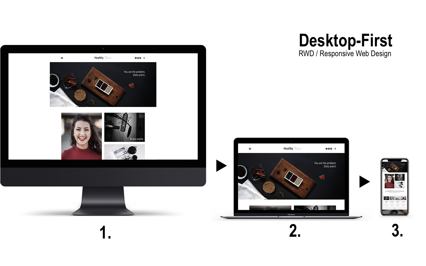
So designers opened their browsers and design tools and started designing with all the colors, fancy effects, sliders and whatnot. That’s not the entire design process but you get the gist of it. And finally when it was time to make it production ready, the designer would use CSS media queries to “fix” the design for smaller screens like the iPad and iPhone.

So now you had a loaded website — with sliders and hi-res images and all which would look like 8Mb of data per page. And it’s now time to fix the layout for smaller screens. That’s what RWD or responsive web design is about. And it was quite a thing in its day.
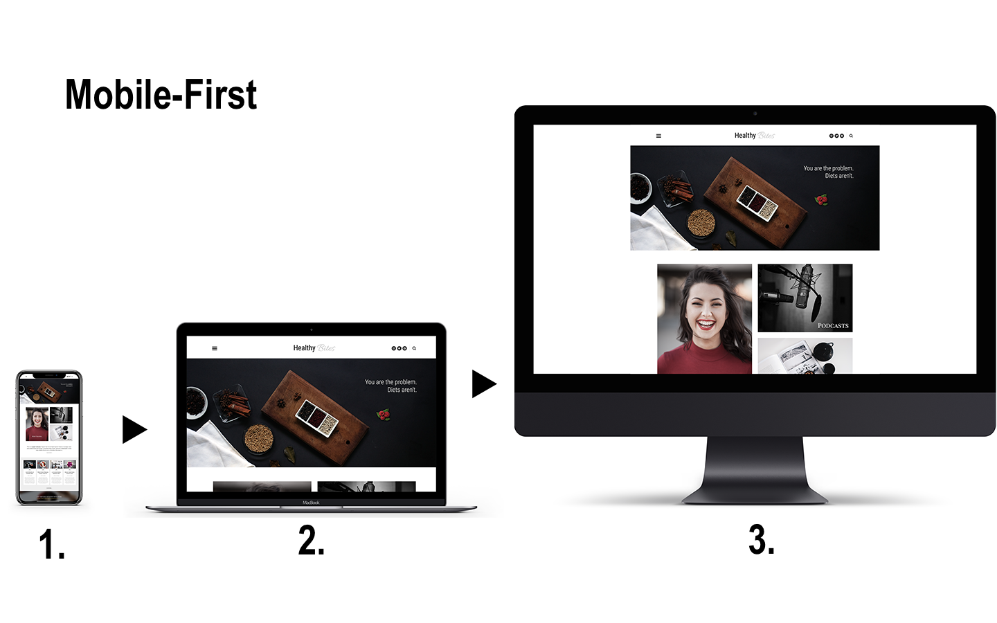
With mobile-first, designers design the mobile version of the website. They work with the given constraints of resolution, bandwidth, portrait layout ensuring that the design works great when the device is rotated to landscape mode. Do you need a slider on the mobile screen? It’s a luxury that you wouldn’t (typically) want to afford.
Once this design is ready, it is then “fixed” or tweaked to scale to larger screens like the iPad or MacBook etc.
The speed benefit comes from the fact that mobile screens don’t warrant complex layouts like a sidebar floating next to the content or humungous hi-res image. So no floats to fix, lesser code, simpler, beautifully elegant yet more efficient user-experience — the zen approach.
Smaller code and optimized graphics load faster, saving time and network bandwidth. It’s a win-win for all.
How to Implement a Mobile-First UX
While this is not an exhaustive post on how to create a mobile-first website, here are some technical aspects of the implementation.
CSS Media Queries
CSS media queries are nothing new to designers who have worked on responsive website design. You identify key breakpoints at which the design layout and composition reflows and adapts to smaller screens. Here’s a crude example.
In a layout with content arranged left and sidebar arranged right and the following element being cleared to fix the positioning of the elements that follow, we have a breakpoint at 600px below which the content and sidebar will stop floating and will occupy full width of the screen to be legible at lower resolutions.
body {
    background: url('../1920x1080-hi-res.png');
}
.content, .sidebar {
     box-sizing: border-box;
}

.content, .sidebar {
    width: 75%;
    float: left;
}

.sidebar {
    width: 25%;
    padding-left: 35px;
}

.clear {
    clear: both;
}

/* Maximize the content and sidebar on devices smaller than 600px */
@media only screen and (max-width: 600px) {
   .content, .sidebar {
        width: 100%;
        float: none;
    }
}
Given that this is a crude example, the primary problem is that the layout is designed for a screen larger than 600px, things are floated around, then cleared to fix the positioning issues. Further, the design is then fixed to work for smaller screens. Oh it loads a huge 1900px hi-res image to look beautiful; now that’s quite a download for a site hitting 1000 visits per day.
Here’s a mobile-first approach:
body {
    background: url('../600x400-retina-res.png');
}
@media only screen and (min-width: 600px) {
   .content, .sidebar {
        width: 75%;
        float: left;
    }
    .sidebar {
        width: 25%;
        padding-left: 35px;
    }
    .clear {
        clear: both;
    }
}
Assuming that .content is a block element, by default there is no style applied at all. It is 100% wide and legible on the screen. Less code! The body background image is low-res by default, thus smaller. And the code in the media query isn’t even rendered by the browser at screens less than 600px.
In the next step comes a media-query that triggers at a breakpoint of 600px and floats the elements on larger screens, if it sees a large screen. Else, things work by default and the mobile-user is the king.
IMG: srcset & sizes to the rescue
What about images? img tags / elements are a part of the markup. While they can be made responsive to fit to the screen, there is a neat little trick that optimizes img elements for various resolutions.
<img srcset="beautiful-fairy-320w.jpg 320w,
 elva-fairy-480w.jpg 480w,
 elva-fairy-800w.jpg 800w"
 sizes="(max-width: 320px) 280px,
 (max-width: 480px) 440px,
 800px"
 src="beautiful-fairy-800w.jpg" alt="My sister dressed as a fairy">
src attribute defines the default image. The srcset attribute contains a list of image choices. The sizes attribute tells which image is best for which resolution. And it’s the browser that automatically decides which one to load. Mobile screen? Small image first!
WordPress natively supports responsive images since version 4.4. However, this doesn’t mean that it will automatically make things work for sliders, landing sections and other design specific source code. That requires pulling images using native WordPress functions and some coding expertise.
The thing to note here is that above lines of code will not make it a mobile first design. It’s this core technology that complex designs are engineered upon to do the magic that it does.
Summary:
We just covered what the mobile-first index is all about, the concept, benefits, approach and a basic proof-of-concept technical-implementation. All that said, some things can help you decide if you want to go mobile-first way:
- Can you afford to lose your search ranks and get less visitor traffic?
- Can you afford to let go of user-experience and live with lower conversion-rates?
- How long can you afford to postpone things?

Updating to mobile-first is a matter of ROI and not a matter of if but when. Larger enterprises may not be able to make a move that swiftly due to delay in internal decision-making and approval processes, etc. However if you are not a heavy-weight, it’s time to leverage your swiftness and one-up the bigger competitors out there.