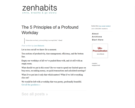
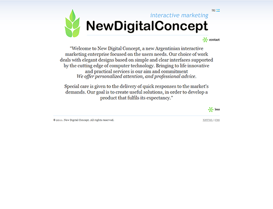
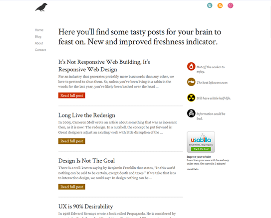
 Minimalism is acting as the trend-setter for modern web designs. White background, simplified layout and minimal color scheme is gaining momentum in the field of web design. Keeping the things simple and minimal helps the designer in focusing on the bare necessities of the website while keeping the distractions at bay. The minimal designs are also good consideration for designing landing pages. The minimal pages often have a clearly defined call-to-action.
The basic concept behind a minimalistic website is “Less is more”. This means that the website contains a simple and comprehensive design that eliminates all distracting and flashy web page elements and brings it down to the most fundamental form — highlighting only those elements that are extremely necessary. Here are 7 tips that which will help you in designing minimalist web design.
-
Contents hide
Simplicity Is The Key To A Minimalist Web Design
Most people interpret simplicity as equivalent to minimalism. The truth is, while minimalism refers to the minimal use of elements by avoiding anything unnecessary, simplicity means an uncomplicated state of mind and the ease to interpret things. Simplicity is the first and and the most crucial step to create a minimalist site. If the elements in your web page are simple enough for the visitor to understand, you have won the first step of the battle.
-
Less Is More: The Adage Holds True For Minimalist Web design
Since the concept of a minimalist website is including only the basic features, a thorough contemplation to strip down whatever is unnecessary is a must. However, this factor depends entirely on the type and purpose of the website. According on your website’s requirement, you can choose to avoid any of these elements which may clutter the webpage — social media icons, taglines, lists (featured, recent, popular, RSS feed etc.), excessive graphic or colors, lot of buttons, newsletter sign up box and use of flash.
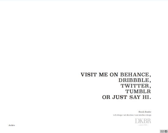
Derekbender.com (Minimal content with a strong call to action) -
Effectively Use Typography
In absence of image and color distractions in a minimalist design, the primary focus stays on your content. As such, implementing a proper typography becomes crucial. Use different font types for headers, content and navigation to make them clearly distinguishable from each other. Also, different font sizes, style and weight can be used for headings, sub headings and content to provide different levels of visual emphasis to each element.
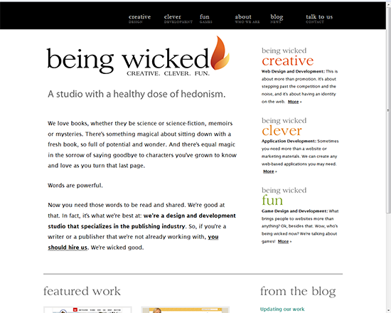
Beingwicked.com uses different font types, styles, weight for emphasis -
Color Scheme: Use Minimal Colors
Minimal design calls for minimal color scheme. The use of colors should be reduced to bare minimal. Font colors mostly used in minimalist web sites are black, gray and blue. However, you can always go for the color scheme of your choice but it has to be contrasty enough to effectively stand out on white/light background. For implementing a proper color scheme, use a monochromatic color (preferably black) for the content. You can however, use a different color for the headers and navigation links.
-
White Background Advantages In Minimalist Web Designing
Using a white background in a minimalist websites has its own advantages. It serves as the negative space that guides the viewer’s attention to the main point of focus — the content. It also creates a proper balance between the elements of the page and makes each element stand out separately and distinctly, so that the viewers are able to interpret each element with priority. A white space wraps uniformly around the content and highlights it thus reducing the visitor’s eye stress while he scans the page.
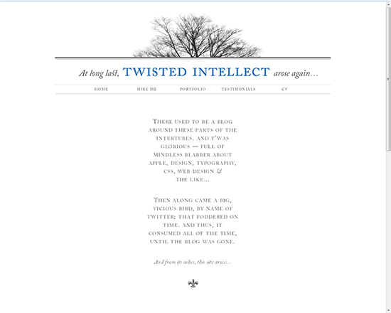
Twistedintellect.com (White background clearly highlights all the elements on the page) -
Organized Layout
Take the help of a grid to place all the elements in an organized manner and use some lines and borders to define their space and fill up for the extra bare look of the website. Additionally, you may use a single but powerful image to replace some words and incorporate a logo to define your brand identity.
-
Take Inspiration From Other Minimalist Websites
Dedicate some time to inspire yourself from the work of others. Visit some of the minimalist websites and thoroughly observe their designs. Use this experience, and your creative talent to innovate a design that reflects excellence with simplicity.
Minimalist web designs are a boon to the fast paced digital world. If used intelligently, they can save you a lot of time and money since they save a lot of server space and bandwidth too. Also, the dominant use of text and enough white space reduces the website’s rendering time and also helps in increasing it’s search engine ranking. Minimalist websites create excellent impression and provide an excellent user-experience. However, it is not meant to serve every individual equally. For e- commerce websites, where product promotion is a must and images are an inseparable part, minimalist websites may not do as well. It is equally unsuitable for people looking forward to earn additional income by placing ads on their web pages. So, whether you need a minimalist web design or not, entirely depends on the purpose of your website.
