Xposure WordPress Genesis Child Theme
A clean, minimal Genesis portfolio and blog theme designed to help you showcase your work to the world, in style.
Showcase Your Work to the World, In Style
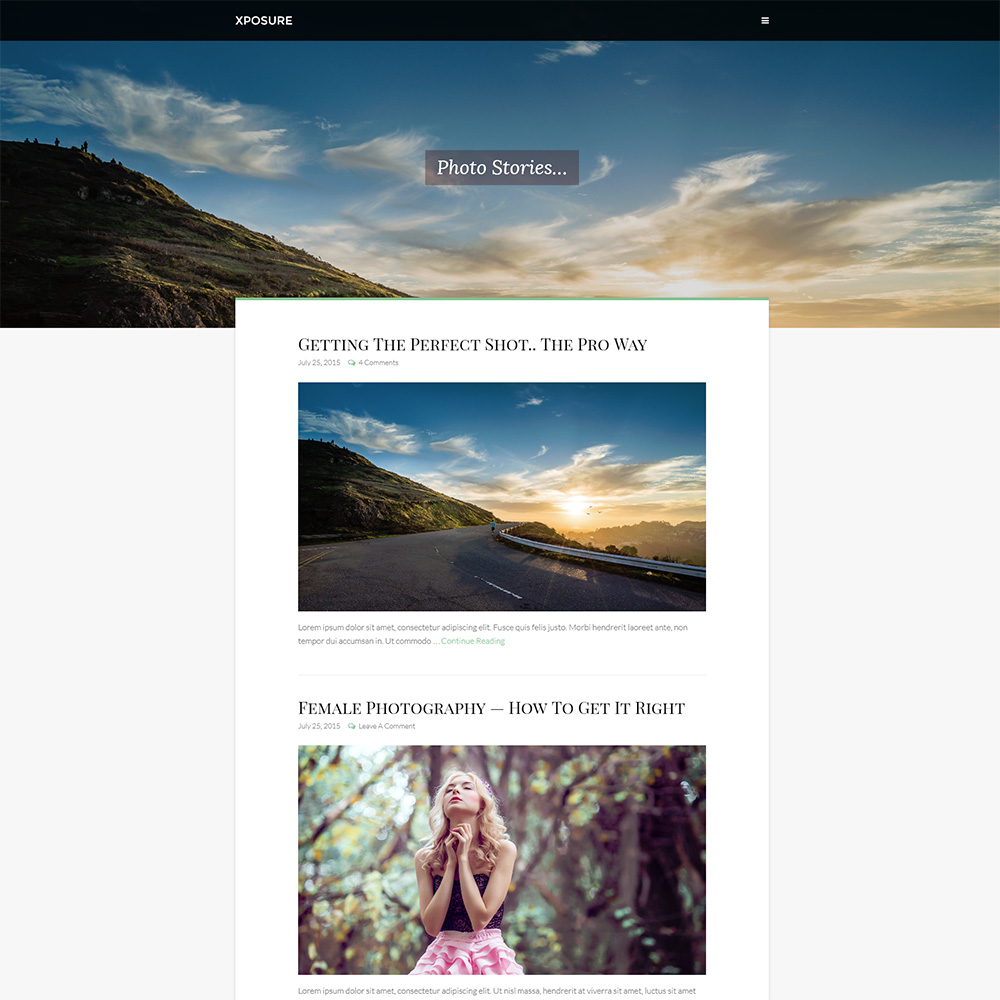
Clean & Minimal Design
Xposure is all about minimalism and elegance. Clean blog layout, shrinkable fixed header, neat typography, Xposure offers it all.
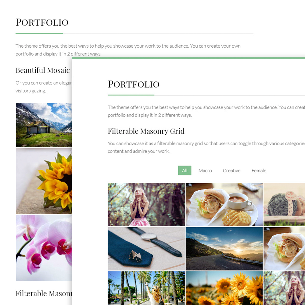
Multiple Portfolio Styles
Full screen slideshows, filterable portfolio grid, mosaic gallery and so many other ways to showcase your portfolio to the visitors.
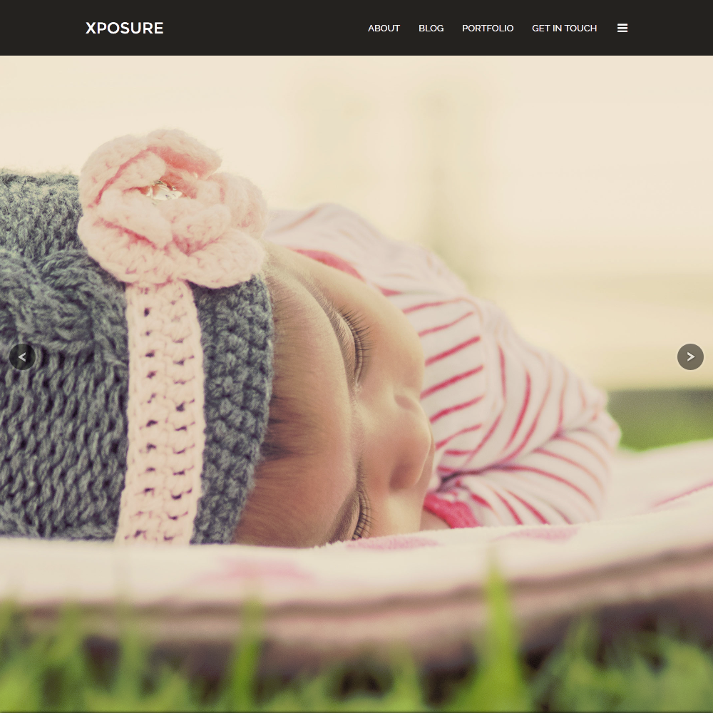
Full-Screen Slideshows
With Xposure, you can turn any page into a full-screen slideshow using Envoke Supersized plugin and the built-in portfolio template.
A Genesis Child Theme You’ll Fall In Love With…
Smart • Flexible • Impactful
Base Features
- HTML5 Markup
- Full Dynamic Mobile Responsive
- Retina Ready
- Translation Ready
- WooCommerce Ready
- Optimized for SEO and Conversion
- Full-Width and Box-Width layouts
- Unlimited Google Fonts
- Utility Shortcodes
- Font Awesome Support
Unique Features
- Theme Options Panel
- Design and Typography Control
- Full Screen Image Slideshows
- Multiple Portfolio Styles
- Support for Jetpack and Envoke Supersized
- Setting for no. of footer widgets
- SILO Menus
- Landing Page Settings
- Mobile Landing Page Settings
- Fully Integrated UI Kit for Extended Control
Killer Features
- Background Featured Images per page/post
- Custom Taglines per page/post
- Filterable Featured Images Portfolio
- Portfolio Template for Full-screen Image Slider
- Built-in styles for Jetpack Gallery
- Fully Supported Jetpack Portfolio Post Types
- Shrinking Sticky Header
- Sleek Expandable Navigation Menu
- Above Footer Widgetized Area
- After Entry Widget Area
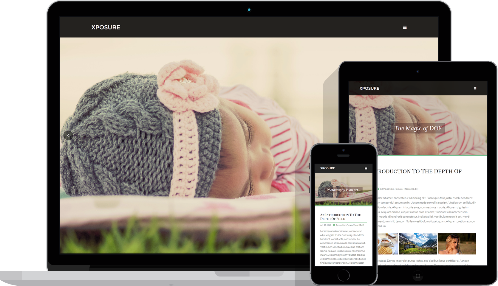
Make Your Website Look Great on All Devices
Xposure is designed to offer a stupendous and consistent user-experience to the visitors visiting your website on any device. Your website will look great on all devices, be it a desktop, laptop, tablet or a mobile device. Xposure makes sure that your website adapts smoothly to all screen sizes, thus keeping the users engaged anytime and anywhere.
Xposure is also retina-ready which means that your website will keep its elegance even on the HiDPI screens and retina displays. Xposure recommends an aspect ratio of 16:9 and minimum resolution of 1920x1080px for all the images that you use on your website so that they come up equally crisp and elegant on retina screens.
Xposure Is About Flexibility and Great User Experience
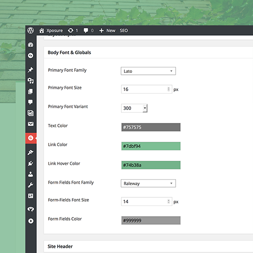
Design Control
Xposure offers an intelligent theme options panel where you can easily tweak the site design, typography and almost everything.
Optimized for SEO & Conversion
Built on a rock-solid boilerplate, Xposure is fully optimized for top-notch on-page SEO, which means better conversion.
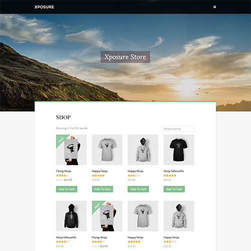
WooCommerce Ready
Planning to set up a store on your website? Xposure has everything in place to help you start selling right away!
Grab Xposure Genesis Child Theme Now
Leave your visitors awestruck with elegant blog, contrasty images, extraordinary portfolio styles and much more…